Improve Conversion by Perfecting the Checkout Process of Your Ecommerce Store
There’s no need to wax poetic how the emergence of ecommerce marketplaces have changed the way consumers shop. The fact of the matter is that it has never been easier and convenient for consumers to purchase anything, from anywhere and at any time. However, many marketplaces still face cart abandonment despite offering consumer-friendly services. This is because most of these marketplaces only focus on improving the UI of the website and do not lay emphasis on the checkout process.
When it comes to the online shopping process, there’s nothing more frustrating than reaching a checkout page that is unfriendly, confusing and difficult to complete.
Consider this: You have spent lots of time, money and effort in creating your online marketplace, incorporating each and every user-friendly feature. You have an engaging landing page, your product description page is enticing, and product photos are spot on. You have a steady stream of traffic on your website, but nothing to show for sales. Wonder why?
If that is the case then there is something wrong with your checkout process and you need to optimize it.
Around 68% of all ecommerce visitors abandon their shopping cart at some point in time. This amounts to nearly $4 trillion of abandoned merchandise. The most crucial part about this is that 63% of this is recoverable by just ensuring a consumer friendly checkout process. This makes it highly paramount for an ecommerce marketplace to optimize their shopping cart and minimize cart abandonment.
So what makes the perfect checkout process?
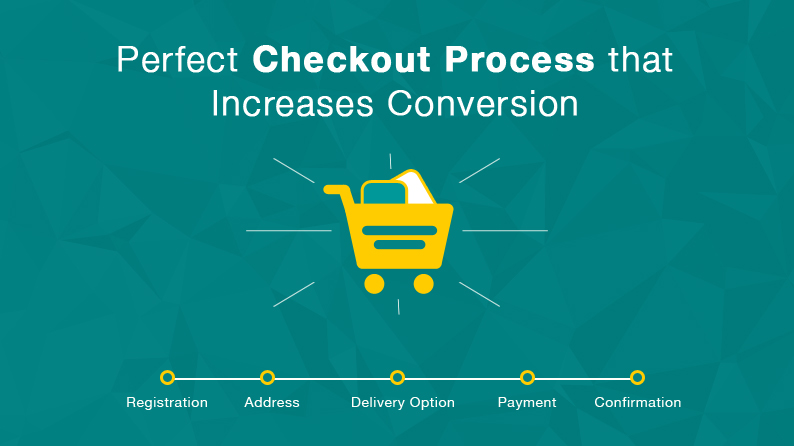
Get the checkout process right and youÔÇÖll end up with no cart abandonments along with happy customers who will be coming back for more. Let us now take a closer look at each and every aspect of the checkout process.
Login and Guest Checkout
Most online store owners believe that this page is basically the least used page on their website. But they fail to understand that the first step towards converting a visitor into a customer happens via the login page. Most visitors turn away from the website if they feel that there are too many fields to fill in the signup form.
The biggest time-consuming part for new customers is when they create their customer account. The key here is to save time and effort in filling of forms.
Expert Tips:
- Make it easy for existing customers to login. You can even use social media accounts to fast track login process.
- Also, include an option to checkout as a guest. This way, visitors can buy a product without going through the login/signup process.
- Rather than highlighting all the mandatory fields with an asterisk along optional fields, you should just show the mandatory fields
- Visually indicate if the user has wrongly filed any detail.
Related Read: Convert One-time Buyers into Repeat Customers
Shopping Cart Page
When a user looks at the shopping cart page they need to feel confident in their purchase. It should clearly highlight each and every aspect of the product that they are purchasing. The bottom line is that no matter how user-friendly your product listing page, it is the shopping cart page that holds the key to conversion.
Expert Tips –
- Display all the product details in the shopping cart.
- Include a photo of the products that the user is purchasing. Almost, 93% of the shoppers say visuals are a top influencing factor that affects their buying decision.
- Give an option to the user to save the purchase for later or add to wish-list. This is helpful in minimizing cart abandonment and increasing probability of purchase going through at a later stage. 54% of shoppers say they might purchase a product left in their cart/wish-list at a later stage if prices come down.
- Additionally, you can also offer an edit option, where users can change the quantity of the product.
- Include the final price to be paid by the customer that includes taxes, shipping price or any other hidden charges. Do not surprise customers with additional fees at a later stage as it acts as a deterrent and the customer will become vary of shopping again on your online store.
Want to minimize cart abandonment and increase sales on your ecommerce marketplace?
Payment Options
You have come all this way right from offering streamlined login page to a user-friendly shopping cart page, but the process has not ended yet. The customer is yet to make the payment and if numbers are to be believed then at least half of the shopping cart abandonments happen on the payments page. The payment page is the one where the customer chooses the payment option and makes the payment.
Imagine you own a shopping center and a consumer comes, puts products in the cart and goes to the billing point to make the payment. If the cashier standing there is not friendly or the process of making the payment is cumbersome, then the customer would just leave the cart there and walk out of the door. The same scenario is applicable when it comes to online shopping.
Expert Tips –

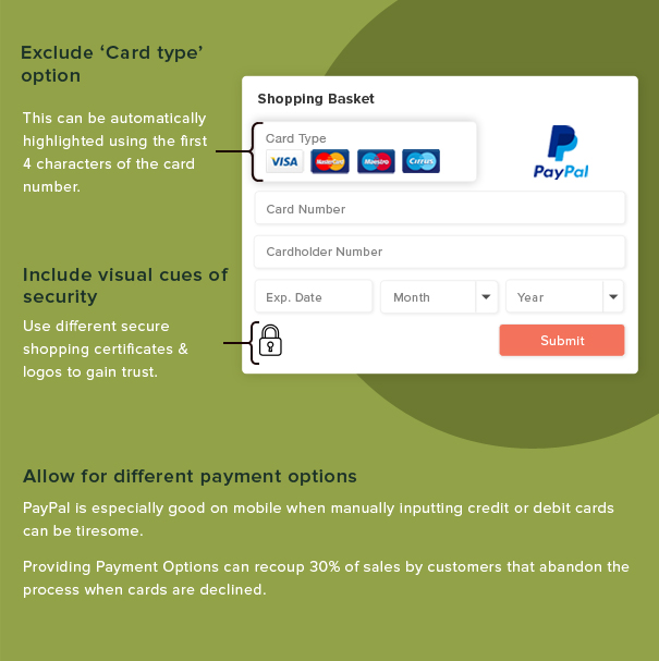
- Give the customer multiple options for making payments. Offering multiple payment options can recoup 30% of sales by customers that abandon the process if their one payment is declined.
- Omit the option where the customer has to choose the type of card as this can be automatically highlighted with first four digits of the card number.
- Highlight security of the page which includes, secure shopping certificates and logos. This is helpful in instilling trust factor in the customer.
Suggested Read: How to increase the Average Order Value of Your Ecommerce Marketplace
Summary and Confirmation Page
A confirmation is highly essential whenever there is any form of conversion. The same is true when it comes to the purchase summary page. This page should be plain and simple, ensuring that the information is easily visible to the consumer so that the customer can assured that he is ordering the right product.
Expert Tips –
- Make sure there is no irrelevant information on this page that has no concern with the summary of payment
- Provide an email ID of the support page, where the customer can reach out if there are some issues with the purchase
- Ensure that the confirmation page is print friendly. Additionally, you can also offer the PDF version of that page.
- If the customer does not have an account with you, ask for the email address and also provide the option signup
Conclusion
In the current market dynamics, it has become paramount for marketplace owners to incorporate certain strategies to maximize revenue. Cart abandonment is a major issue faced by most ecommerce marketplaces accounting for the bulk of the revenue loss. The major reason for cart abandonment as discussed above revolves around cumbersome checkout process.
ThatÔÇÖs why, when building an online store, one must pay head on each and every aspect of the checkout process of the ecommerce platform. It should all the key features required to build a user-friendly shopping cart page, as well should be designed focusing on the customersÔÇÖ requirements.


